Why Seeing Still Matters in Big Data Biology
Biology probes form and function of Life. Form is easy to grasp: cells under a microscope, subcellular structures in electron micrographs, or organisms on camera readily present their shapes.
Function is different: it emerges from molecular compositions, interactions, and temporal changes. Such data is not directly visible - we use statistics to make sense of it. But summaries and p-values alone rarely reveal how complex biological systems are organized, the variability in the samples and the resulting uncertainty in the data, or unexpected relationships and pattersn. As datasets grow larger and more complex, these insights only become accessible when data are visualized.
Despite being used widely, data visualization is still treated as a final step in research, a way to communicate results once the real analysis is finished. In reality, visualization plays a much earlier and more fundamental role. Visuals expose batch effects, hidden subpopulations, nonlinear behaviors, and experimental artifacts that often remain invisible to summary statistics alone. These insights directly shape which data can be trusted, which controls are needed, and which experiments should come next.
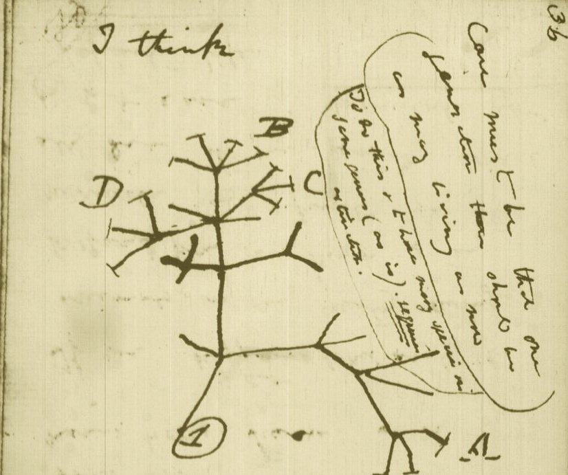
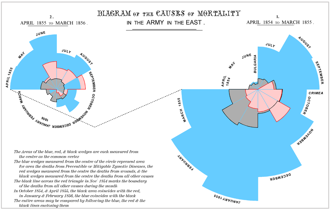
While the urgency to visualize data feels modern, the principle itself is not new. Seeing has always been central to biological understanding. Darwin’s and Linnaeus’s classification of species relied on careful visual comparison. In the nineteenth century, Florence Nightingale pioneered statistical charts to reform healthcare, while John Snow’s maps of cholera outbreaks transformed how disease transmission was understood. In the twentieth century, Michaelis and Menten introduced the kinetic plot as a standardized visual language for enzyme activity, and more recently, interactive genome browsers have made entire genomes navigable at nucleotide resolution.

Today, data visualization is however still poorly formalized in the life sciences. It lacks dedicated training programs, shared standards, and institutional recognition. This gap matters, as data visualization leads to hypotheses generation, insightful data presentation, and builds trust in the results.
Just as early scientists needed training in scientific drawing to accurately document what they observed, today’s researchers must learn to engineer and interpret data visualizations with comparable rigor. In an era where biology increasingly unfolds in data rather than images alone, learning how to see again has never been more important.