30+ charts
The #30DayChartChallenge is an annual festival for chart-lovers around the world. There is a daily visualization challenge and participants submit their contributions online. Datasets, data analysis, tools, and presentation is entirely up to the participant. All entries are posted on twitter along with a hashtag for the day, from #Day1 to #Day30. The resulting diversity and personal interpretations are the charm of the challenge and a joy to data scientists and visualizers alike.


 All charts
My 30DayChartChallenge
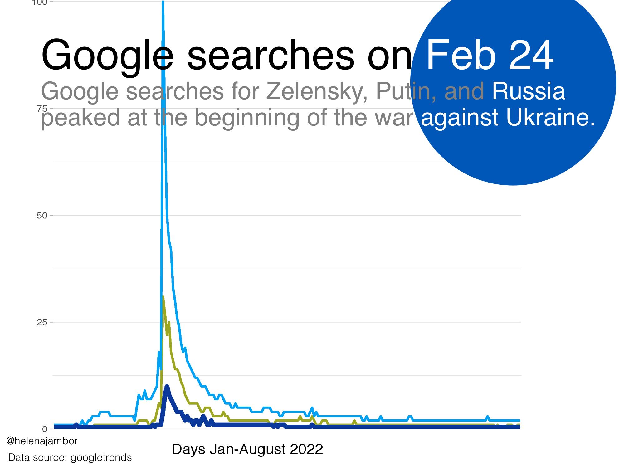
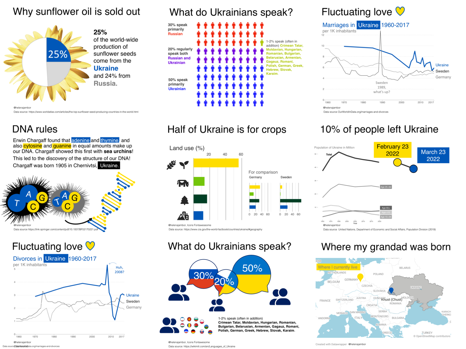
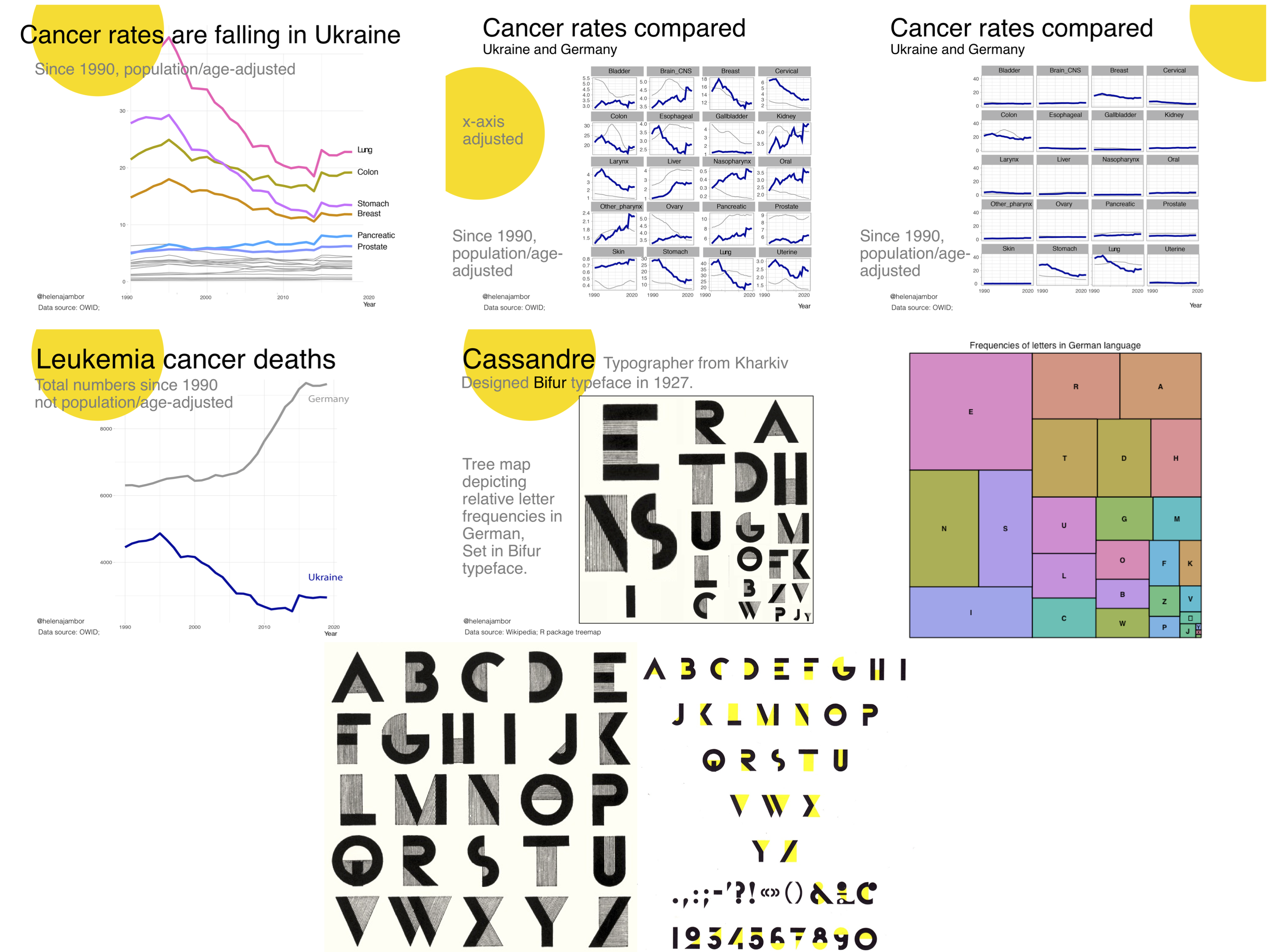
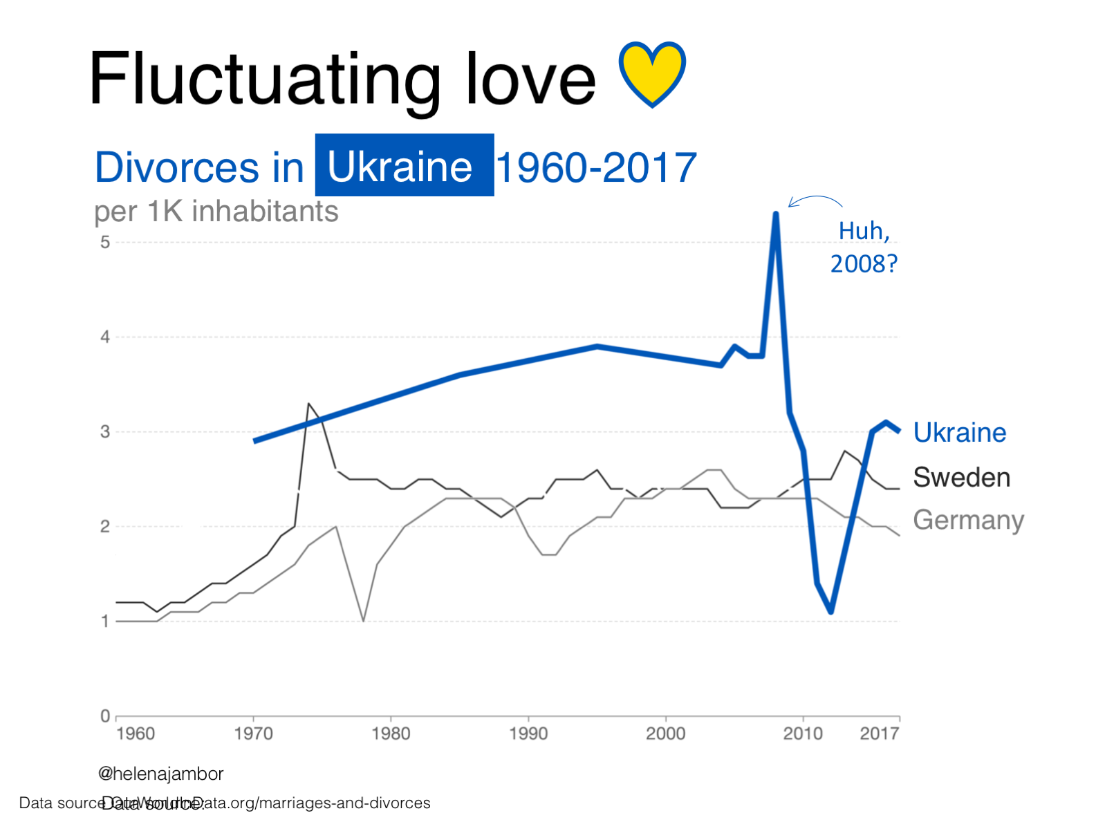
I personally was looking for an excuse to get back to making charts with R. All I could think of at the time was however the war in Ukraine. My granddad Anton Jámbor was born and raised in Khust, Zakarpatia Oblast, which was another reason to finally educate myself about Ukraine. So, I made a plan and almost completed it! I researched the people and population of Ukraine, the country and cities, and a little bit the health data since my day-job is in medical research at the University hospital.
From idea to implementation:

Moving along: the daily charts
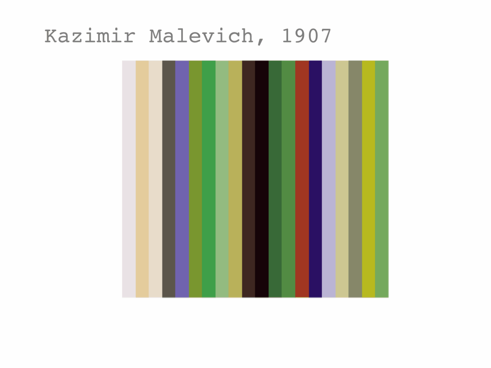
Over the course of April I completed 18 of the 30 challenges. Many times I made several solutions and tested many more. Below is the example for Kazimir Malevich. I plotted the color-schemes he used in his paintings over his lifetime and tried our several options, including an animation.
Kazimir Malevich was born in Ukraine and is famous for monochrome,abstract paintings. However, that was a brief period, before and after his paintings are full of colors! I analyzed his color-usage over his lifetime. This was one of the few datasets I created myself. 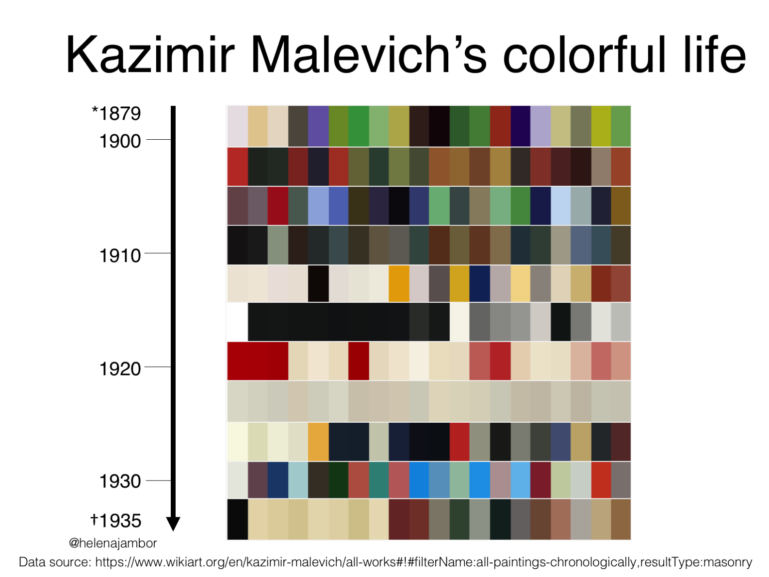 Malevich’s colors from early to late periods as bar charts
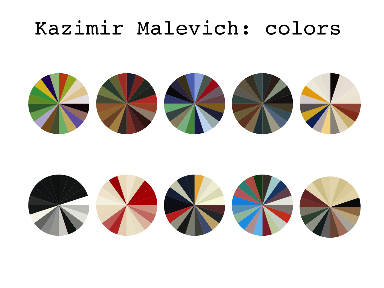 Malevich’s colors from early to late periods as pie charts
 Malevich’s colors animated
Finding time each day for a full month was impossible with Easter vacation and care work requiting my attention. Now, in a calm summer, I finally completed five more challenges for which I had already found data. I posted these final entries on Ukraine’s Independence Day, coinciding with 6 months since the war starts.
My Design objectives
My goal was to create a visually and thematically cohesive work. I plan to use my charts for teaching purposes and for teaching the many ways how we can communicate data with charts. Most of my time, as always, was spend on finding a topic for which a dataset was available. A lot of time was also consumed by data wrangling and getting it in a format to actually make charts. And only a fleeting moment for creating the visualizations. That’s how it goes!
Enjoy my charts, Slava Ukraini and keep Ukraine in the news!