Last week I visualized the days I did sports in 2017 by hand with illustrator. Most of the time, we want however re-tell similar data (I am not giving up sports anytime soon!), so I always look for ways to create visualizations computationally, for example in R. Therefore, today, I show you how to make a viz of data on days of a year in R.

First step: googling (or: duckduck-ing) to find a package other people use for this type of visualization. To my surprise, this took a very long time! Apparently, there is no default package in R that can visualize calendar data!? I found a very laborious solution that someone made with ggplot (referenced here: https://www.r-bloggers.com/ggplot2-time-series-heatmaps/), but it was > 10 lines of code. I then stumbled upon another package, made specifically for visualizing pollutants in air (!), but it works also for other data and is straightforward to use. “openair” takes any dataframe with a “date”-column in the standard format (YYYY-MM-DD) and plots whatever you define as the “pollutant”. In my case, the days I did sports were the “pollutant”.
3 easy steps:
- Open your data in R, I called my dataframe “sports”.
- Then load library(openair)
- Plot:
calendarPlot(sports, pollutant = sports, year = 2017)Voila! 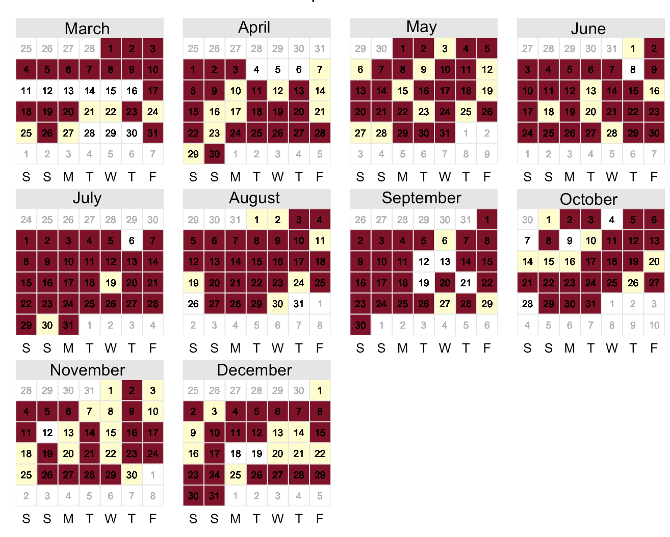 Red: days I did sports, yellow: lazy days, white: sick days.