Paper Alert: this is now published in PLOS Computational Biology!
How to… Graphical abstracts 1
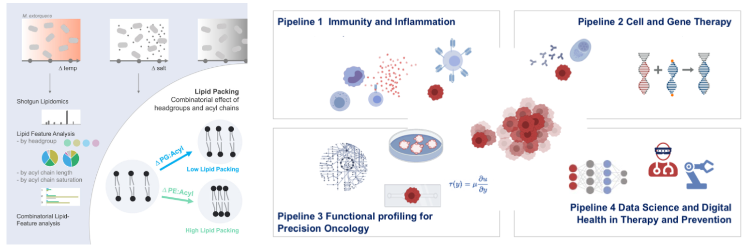
Graphical abstracts are increasingly common to explain biomedical concepts and research results. As “summary slides”, they have long been used at the end of a talk or lecture. Today, graphical abstracts are widely used as a thumbnail/preview of online publications and also found at posters, on lab websites, and in research grant applications. The key element of every graphical abstract are the visuals - pictograms, icons, or images. Text, arrows and lines then combine the visual elements into a narrated story, and color highlights key elements or encodes quantities. I summarized a few key points to consider before designing a graphical abstract.
Key visual: find icons and pictograms
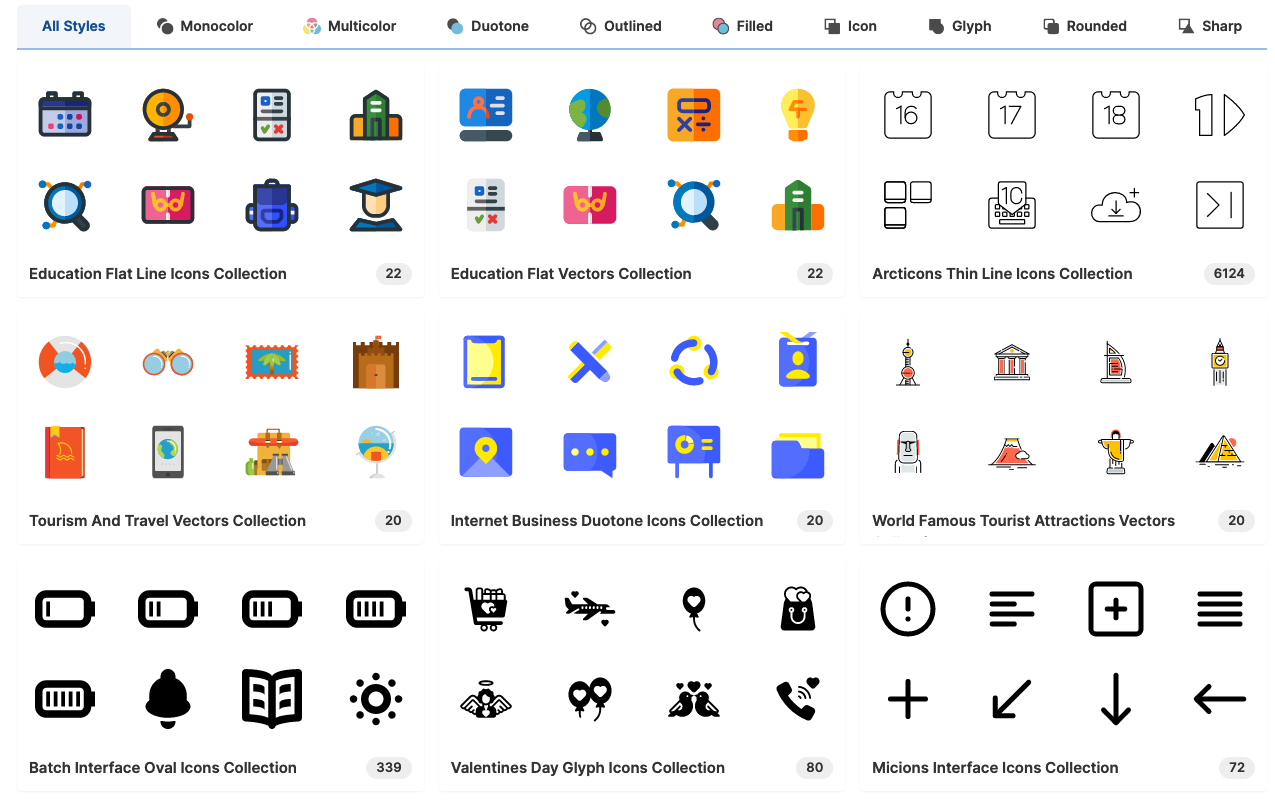
All graphical abstract have key visuals and usually these are icons, pictograms or symbols, less common are iconic microscope or photographic pics or charts. Pictograms can be illustrations, constructed from simple shapes, but mostly are found in icon libraries. Many icon libraries are free and some can also be used without attribution (public domain). In libraries, icons can be downloaded as PNG or SVG file. PNG, Portable Network Graphic, is a raster-graphics format for lossless data compression. PNGs are ready to use on the web or in software, but are not adaptable. SVG, Scalable Vector Graphic, is a vector images format that can be used interactively on the web, adapted with graphic software, and also used as image as is. Best: you can scale it as large as you like and no pixels will appear. Yay for large posters!
Libraries for general icons:
PowerPoint (newer versions) come with free image and icon libraries, as well as many pre-drawn shapes.
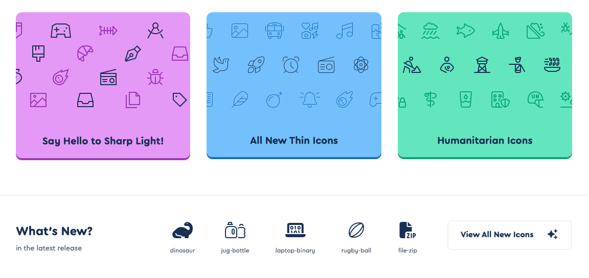
SVGrepo is currently the largest (500.000!) general resource and has a pretty cool style search function (by color, rounded, filled/outline, sharp/rounded icons).
Nounproject is a large repository sourcing icons from various designers, hence the available icons are vast, but also not matched in style, icons can be used for free with attribution as SVG or PNG.

Fontawesome is a unicode-based icon library that also can be installed locally as a font for graphic programs or downloaded as SVG.
Biology and Medicine specific icons are in addition available.
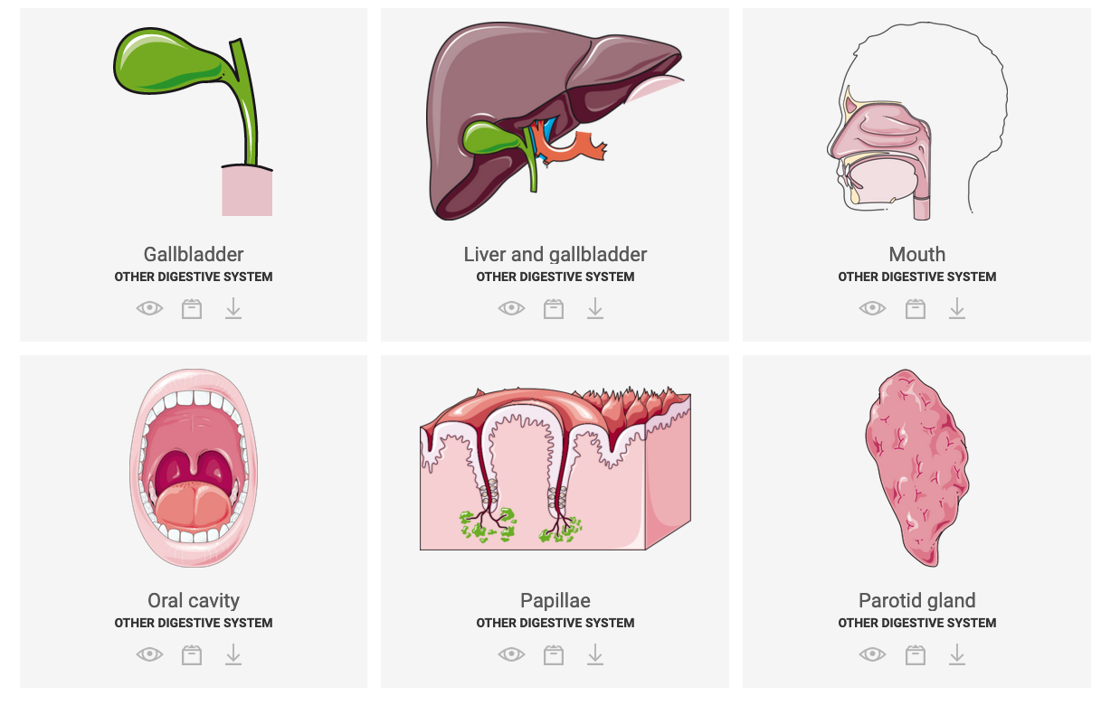
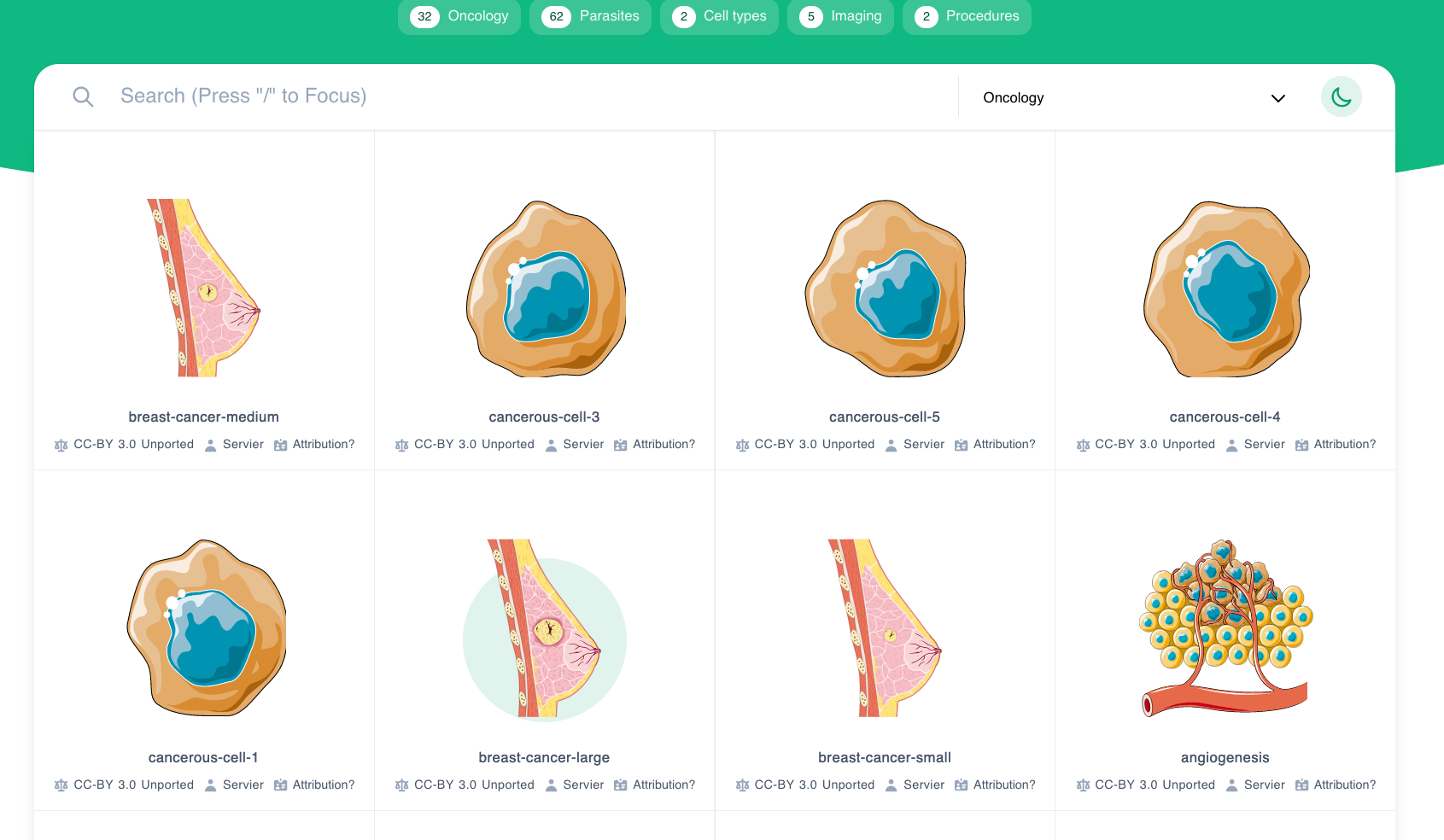
SmartServier released full slide-decks with medically-relevant images - lots of detail for diseases!
Biocions releases a growing list of biology and laboratory icons, such as Petri dishes and model organisms, mostly as CC0, and it accepts submissions to expand this library!
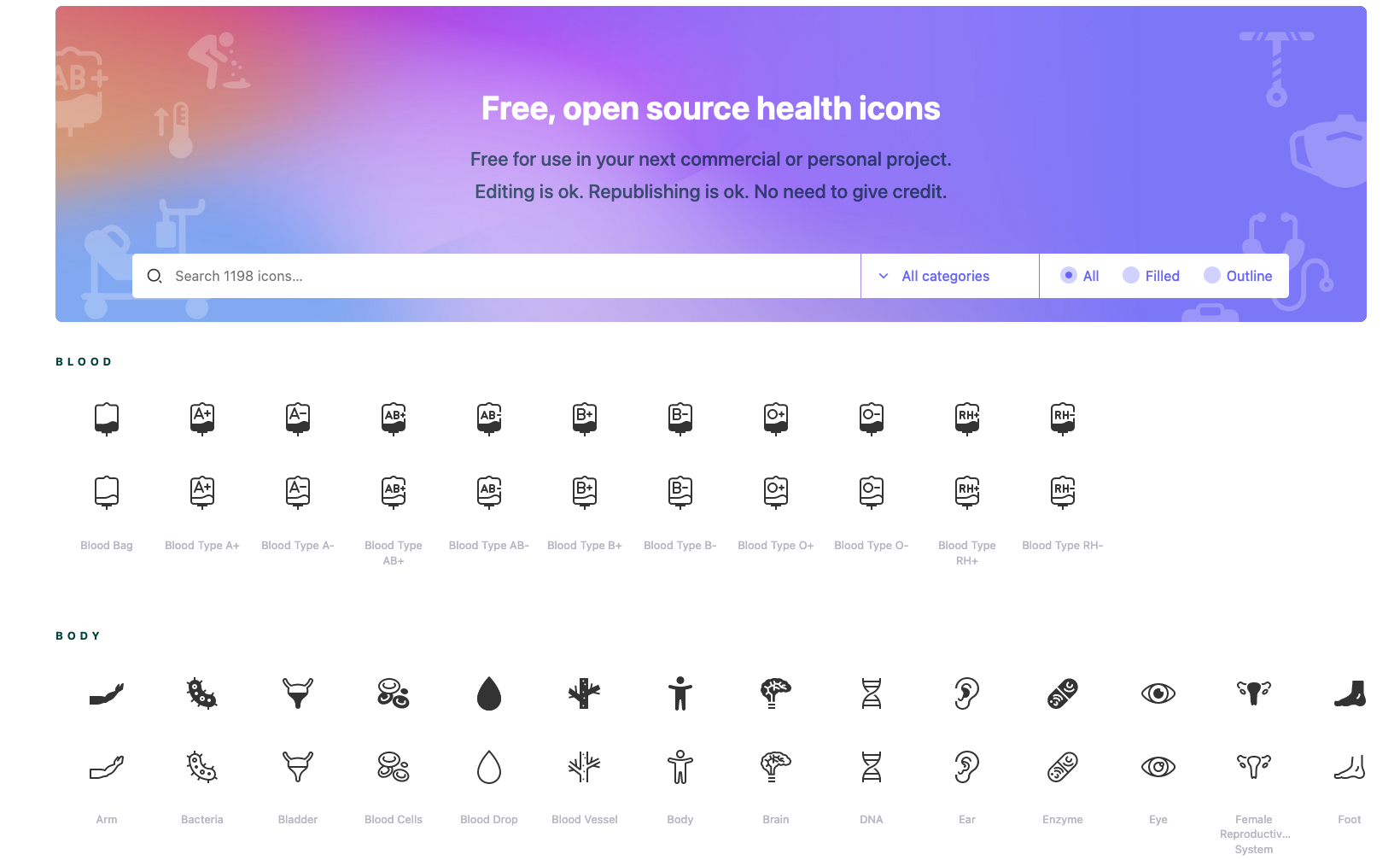
Healthicons has many really simple icons for specialized medical scenarios. Free, no attribution, downloadable!
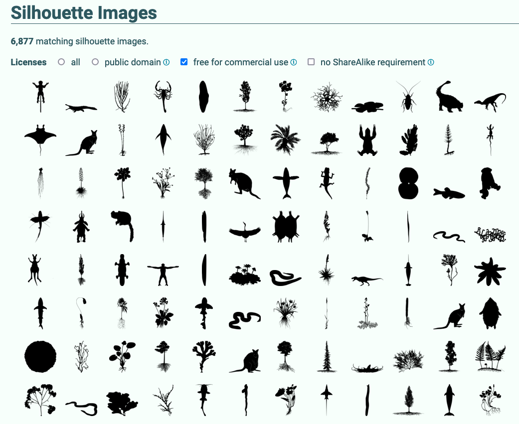
Phylopic has 7500 shapes of animals, plants, algae, , e.g. for phylogeny tree, most in public domain and free to re-used. You can curate your collection. Thank you Michael Keesey !
General scientific icons from the EBI, many related to bioinformatics! (But also: Bomb.. wonder how that entered the collection!?). Very neat, you can request support and icons!
Reactome started a collection of scientific pictograms and chemical drawings for free re-use and encourages the upload of user-designed pictograms for sharing with the scientific community. I have not seen it grow much, wonder where it will go.
When selecting icons for a graphical abstract make sure all icons have an overall similar appearance: same line-width, colors, and level of detail. Many times icon libraries have a design team to ensure this, but open libraries collect pictograms from various designers with quite distinct appearance. When you want to adapt icons to match in style, get the SVG file which is adaptable with e.g., Inkscape or Illustrator.

Key visual: data in chart
When a key visual should show data in the form of a chart, it is advisable to stick to the most common chart types, bar, line, pie chart or scatter plots. Most readers are familiar with these and they are founded on our core visual perception abilities, comparing lengths, angles, or slopes. For all charts ensure that only a few categories or data points are included and details, tick marks, axis label, legends, are omitted.

Complex charts should only be used if they have e.g. iconic status to indicate a specific method was used: in life sciences t-SNE often symbolize single cell data was obtained, and red/green heatmaps indicate microarray data.
A good overview of chart types and their use is summarized in data viz catalogues (e.g., The Data Visualisation Catalogue)
Tools
Graphical abstracts can be prepared with the same software also used for posters and figures. Many of you will use PoswerPoint. Suitable vector-design software are:
- Adobe Illustrator (commercial)
- CorelDraw (commercial)
- Affinity Designer (commercial)
- open-source: Inkscape - this sweet readers, has direct link to many icon libraries (newest version)! Go to File > Import Web Image > select library.
Vector-based graphics programs allow zooming in and out without quality loss. For most graphical abstracts PowerPoint will also produce sufficient results when slides are adjusted in size and exported as vector graphics, e.g., as PDF. To prevent pixelation select that images are not compressed in the options. A big plus of the open source Inkscape: it keeps getting better. Newest feature: direct import of icons from web-based icon libraries via “Import Web Image” tab. This works already for Bioicons and Reactome via dropdown. Also possible in Inkscaoe: script-based image processing, and script-based chart preparation. Another plus, Inkscape relies on the web vector format SVG and is thus readable by browsers and other vector graphics programs.
Web-based tools
A popular, however increasingly costly option are Biorender and MindtheGraph, that have annual subscription plans. Biorender has many sample templates for a quick start and vast icons for life sciences, but you must regularly check the licenses as they are constantly adapted. As of now the first author must hold a premium license to publish their figures – which is tricky for labs as first author usually does not make all figures, or when authors leave lab etc. Mindthegraph has a similar offer, and also provides design consulting.
Key message
Before starting the design process, spend a good amount of time brainstorming the key message you want to get across. I personally do this by doodling on paper and discussing with peers. Without a clear main message, it will be impossible to design a good graphical abstract. These days a quick conversation with ChatGPT may also help to towards summarizing an abstract to a punchy one-to-two sentences condensed version.
 See more about layout in Graphical Abstracts 2 and text and colors in Graphical Abstracts 3
Note, an earlier version of this post lives at my wordpress site