Paper Alert: this is now published in PLOS Computational Biology!
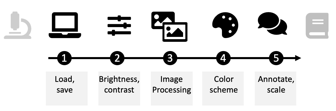
How to… Graphical Abstacts 3
I described tools and icon resources in Graphical Abstracts 1 and how to organise the page for a legible graphical abstract in Graphical Abstracts 2. Now, as the last step, we can add a little text where necessary, quicker orient readers with colors, and make sure we got it right with a little feedback.
Text
A minimum amount of text will be necessary in almost all Graphical Abstracts: to explain arrows, images, and point to conclusions. Of course, keep text to a minimum and understandable, i.e., without jargon or abbreviations. Use easy to understand language: you may want to use popular keywords or phrases to rapidly grab attention and orient audiences. Text may have to be added to label pictograms that are otherwise ambiguous or that are uncommon. A circle could mean molecule, area, cell or similar. 
When no images are available, e.g., for highly specialized words, text can be used as a substitute for images.
Think of all text as legends to your visuals! In this spirit, try to encode your text annotations the same way as the visual element they are encoding.


Colors
We first and foremost make graphical abstracts as a visual appetizer for our readers, and as such they should be attractive and colorful. In all visualizations we use color to highlight or contrast (see also examples with text above), to depict the natural appearance of a visualized object, or to encode numbers: sequential/continuous data should be encoded with varying saturation of one color, diverging data with a 2-color scheme, and qualitative data may be encoded with varying color hues
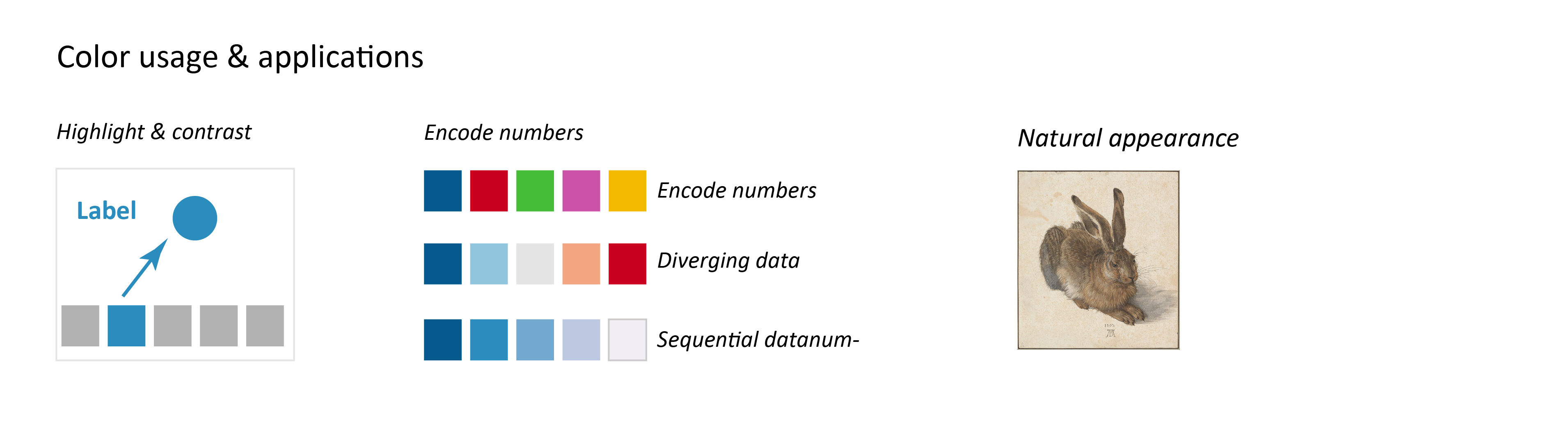
Consistent colors
In all cases it is important to use colors consistently. The color code/color scheme should be maintained within the abstract and also between abstract and the main manuscript. A change in color is considered to also be a change in meaning – colors should therefore be carefully chosen. As colors are perceived immediately, they should overall be used sparsely to not overload readers and distract from the main message.
Accessible colors
When selecting colors, authors should always ensure that colors are accessible to all readers, including color blind audiences. We included many color suggestions in our big survey of image figures published in PLOS Bio: 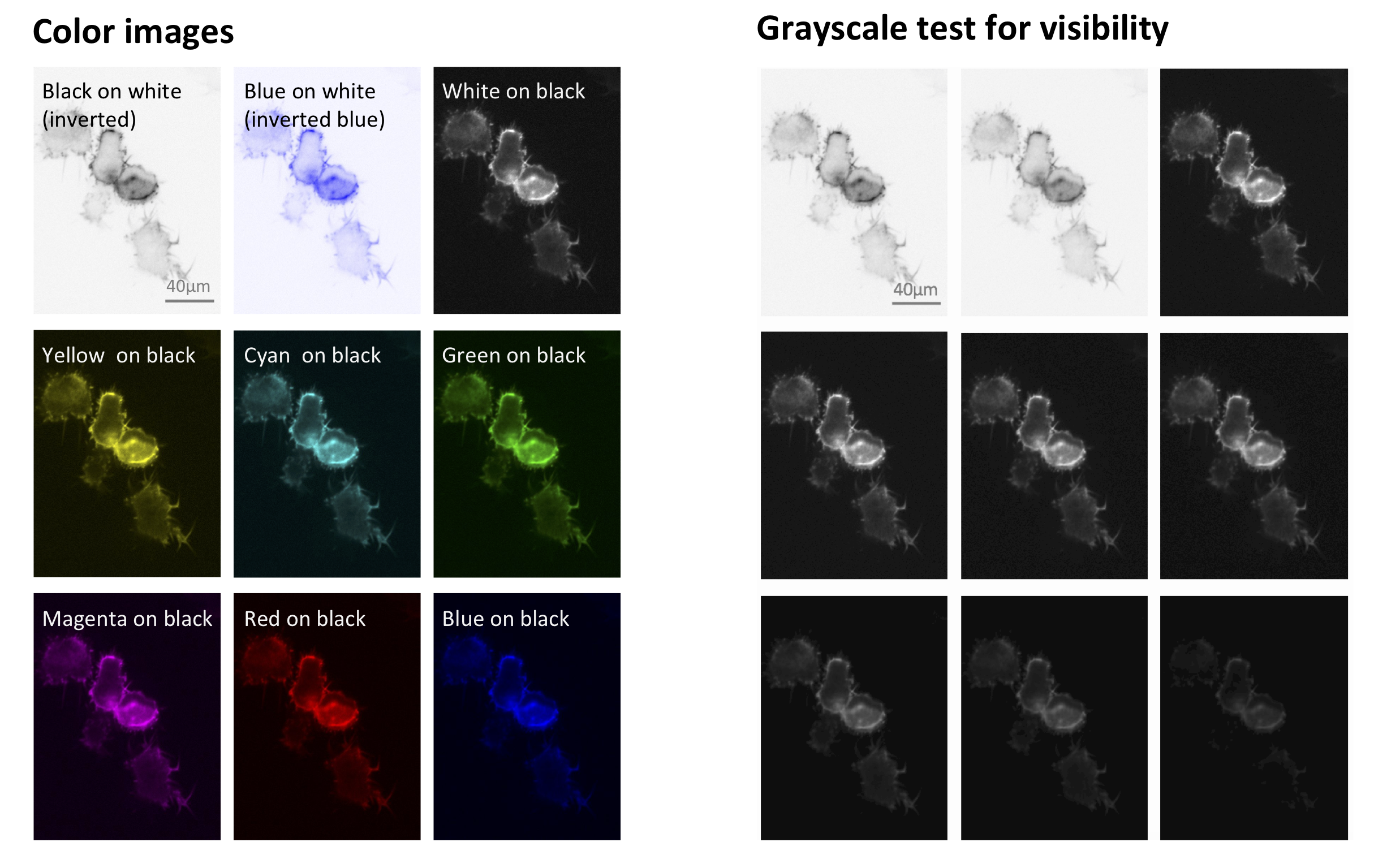

And, the importance of making all your figure accessible to color biond was was prominently highlighted in a technology feature by Alla Katsnelson in Nature, featuring also my humble opinion.
Tools for selecting colors and color schemes:
ColorBrewer was developed for data color schemes in maps, but is easy to use and works perfectly well for other sciences need to visualize data.

Paletton lets you choose attractive color combinations using a color wheel, e.g. adjacent colors for harmonious appearance or complementary colors to contrast scenarios.
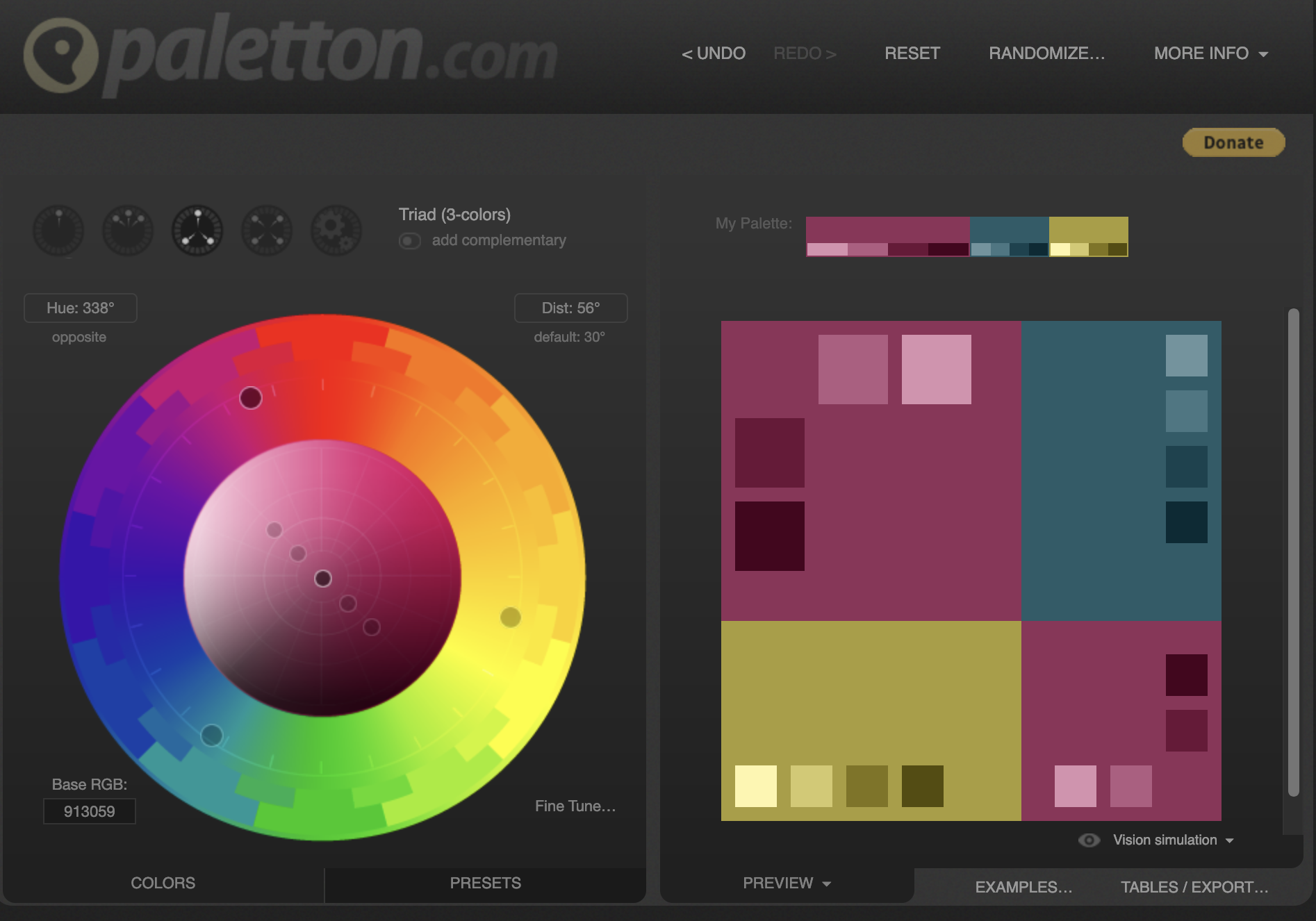
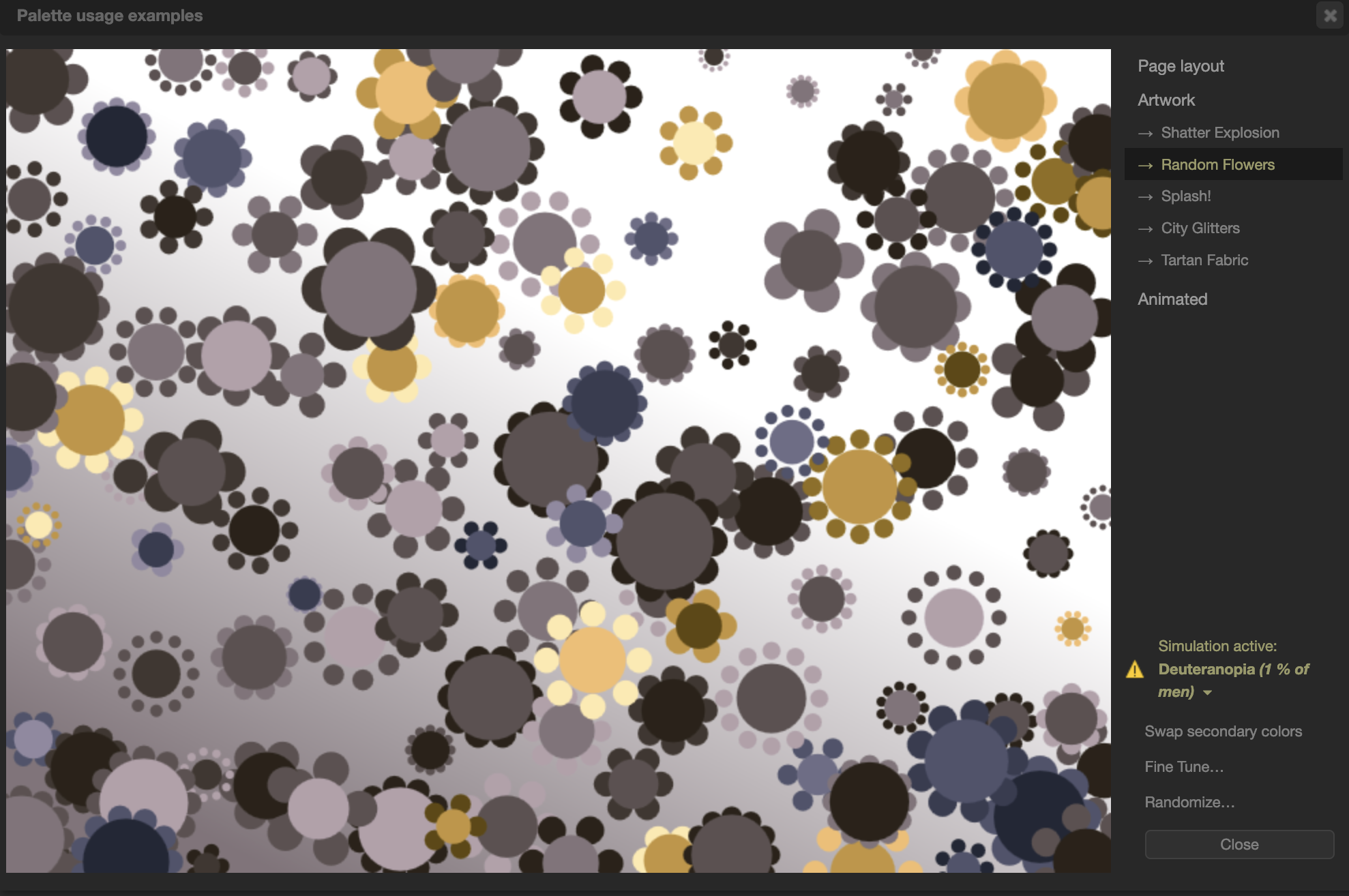
Neat: with palettton you can try out your color combination in a mock website/poster, in an art-work similar to a graphical abstract scenario, and also check how color combinations are visible to color-blind audiences:


- IColorpalette let’s you pick a color scheme based on your favorite art work! Here’s one for all of us longing for some holiday!
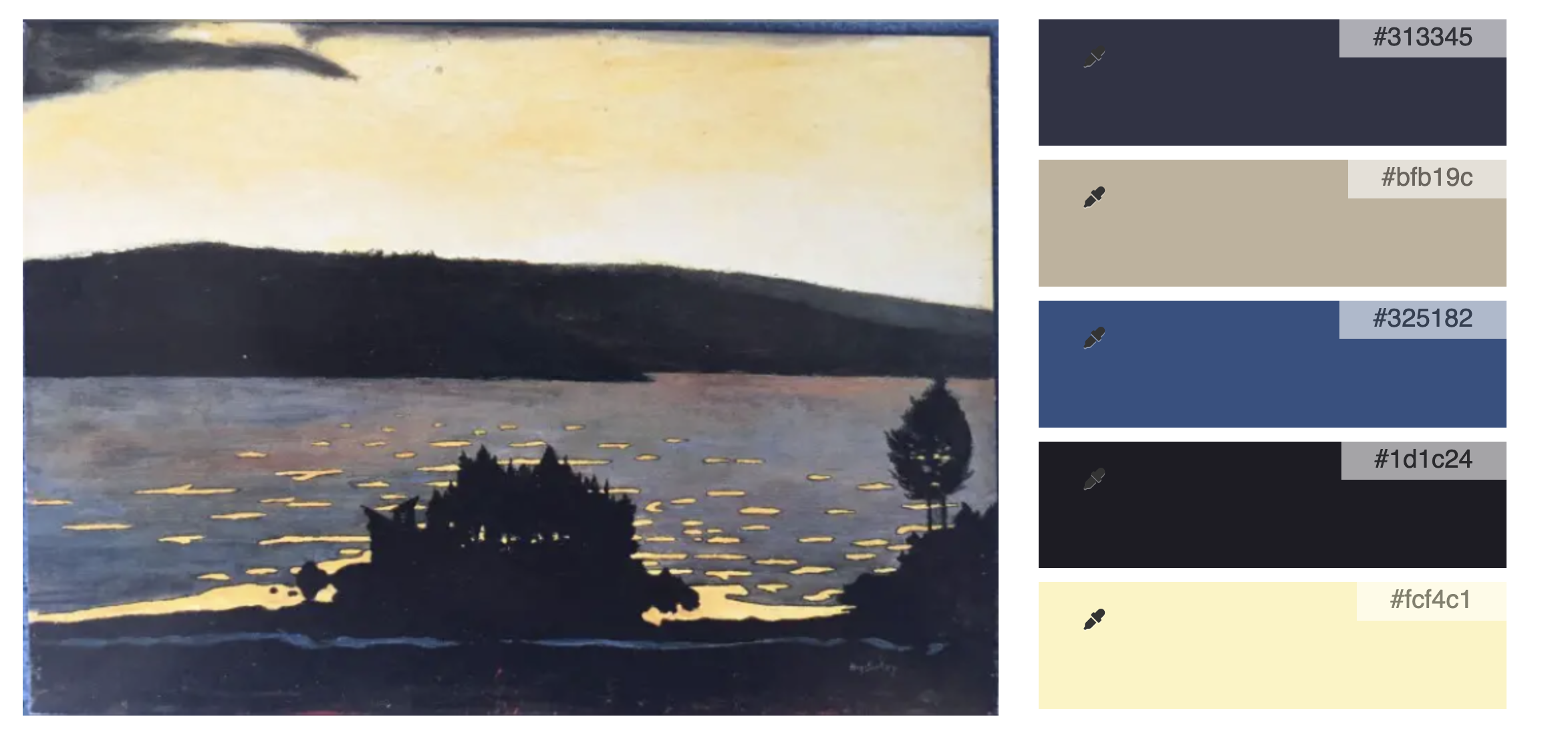 Bonus: you can download the SVG file and directly use the colors via the color pipette!